


BOLD HORIZONS OF BERLIN
Peel and Stick Vertical Poster
Free 9-days delivery
Customize your piece
Couldn't load pickup availability


Pattern browser
Not sure about this design?
Browse all 1184 posters side by side and filter by room, style and colour.
Take a closer look
Our designs aren't your typical, predictable "oil painting": you'll find intentional stains, scuffs and ageing effects. Zoom in on the photo to see every detail!
P.S. Screens can be deceiving: the colour in real life may differ slightly from what you see on your phone or monitor.
Dimensions:
- 80x120 cm
- 60x90 cm
- 40x60 cm
Mounting:
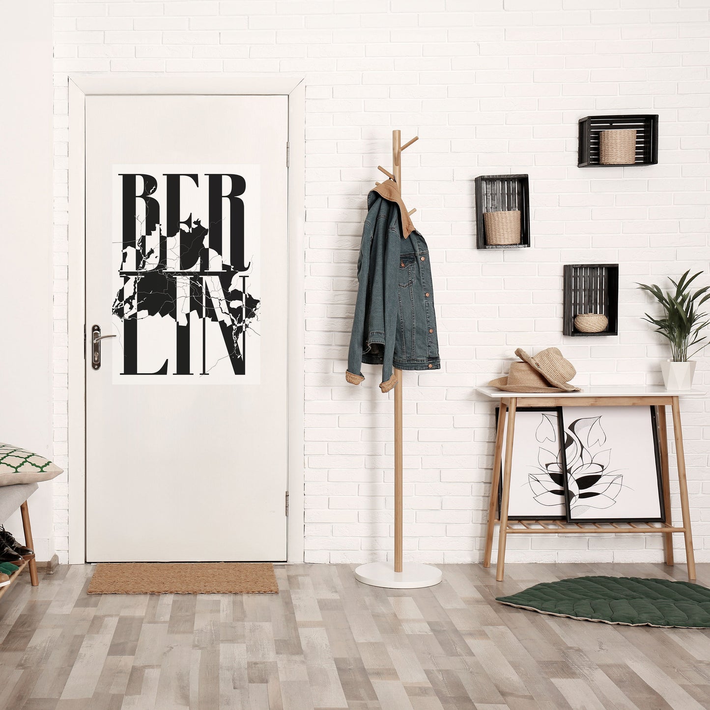
- Easy to stick and peel off on any surface
- Or mount it in a classic frame
Material:
- Monomeric PVC film
Product description:
A poster you can stick wherever you want - or frame it
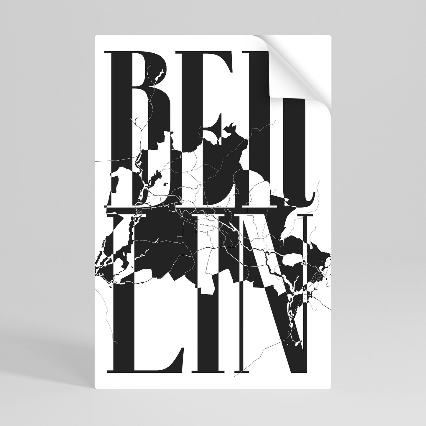
Printed on dot adhesive film - stick it, peel it off, no marks left behind. No bubbles, no drama.
If you change your mind, you can easily peel it off and move it elsewhere. No marks, no problem.
And if you prefer the classic look - it fits standard-size clip frames, so you can frame it and hang it like a regular poster. The colours are strong, and the finish really makes an impact.
Minimal effort, maximum effect. PERIOD
All our products are made to order - directly after you place your order. We do not keep items in stock, which means every product is created especially for you. You can be sure you’re receiving a freshly made product, carefully prepared to meet your expectations. This approach allows us to maintain the highest quality and uniqueness of each item.
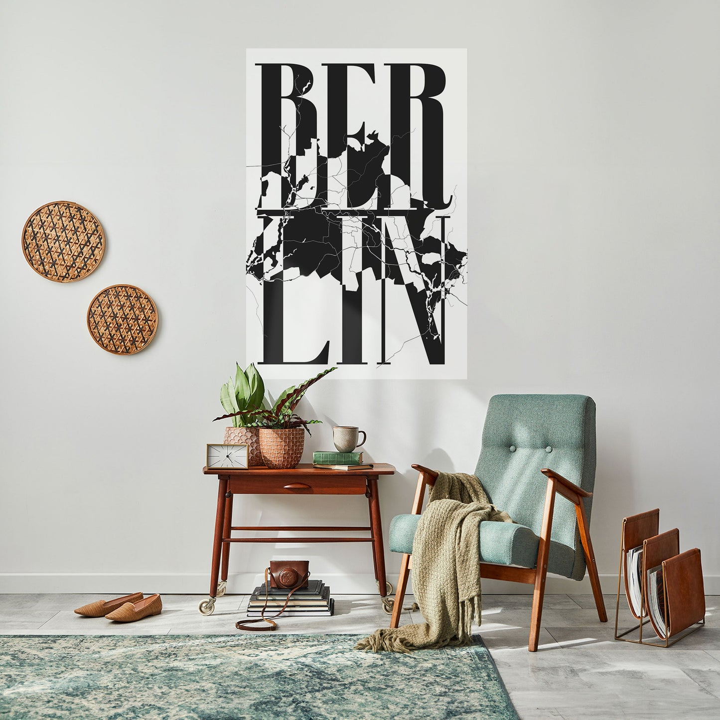
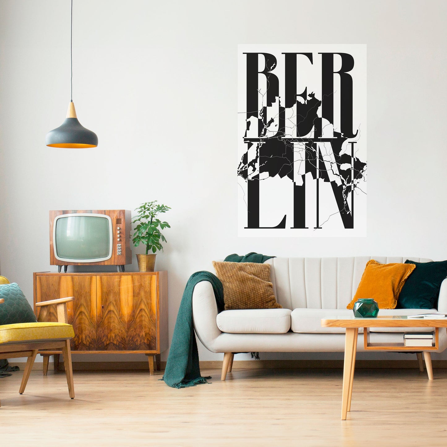
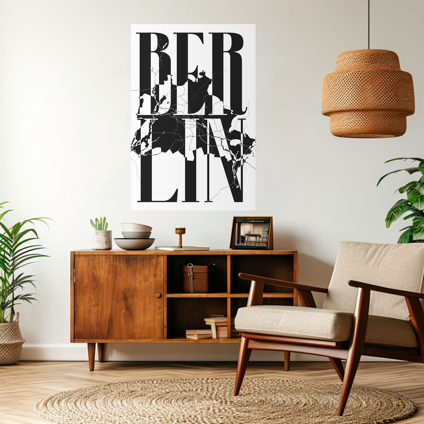
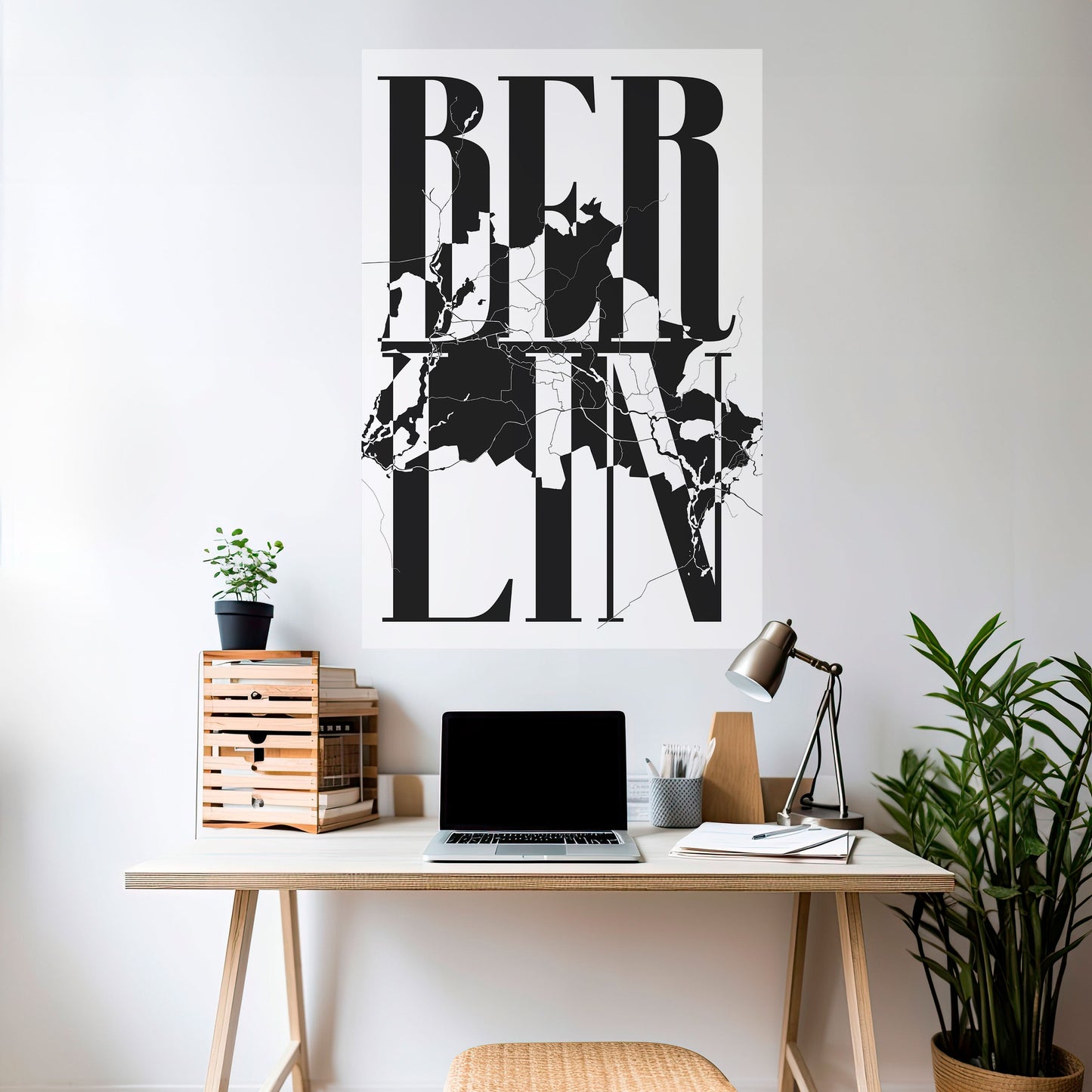
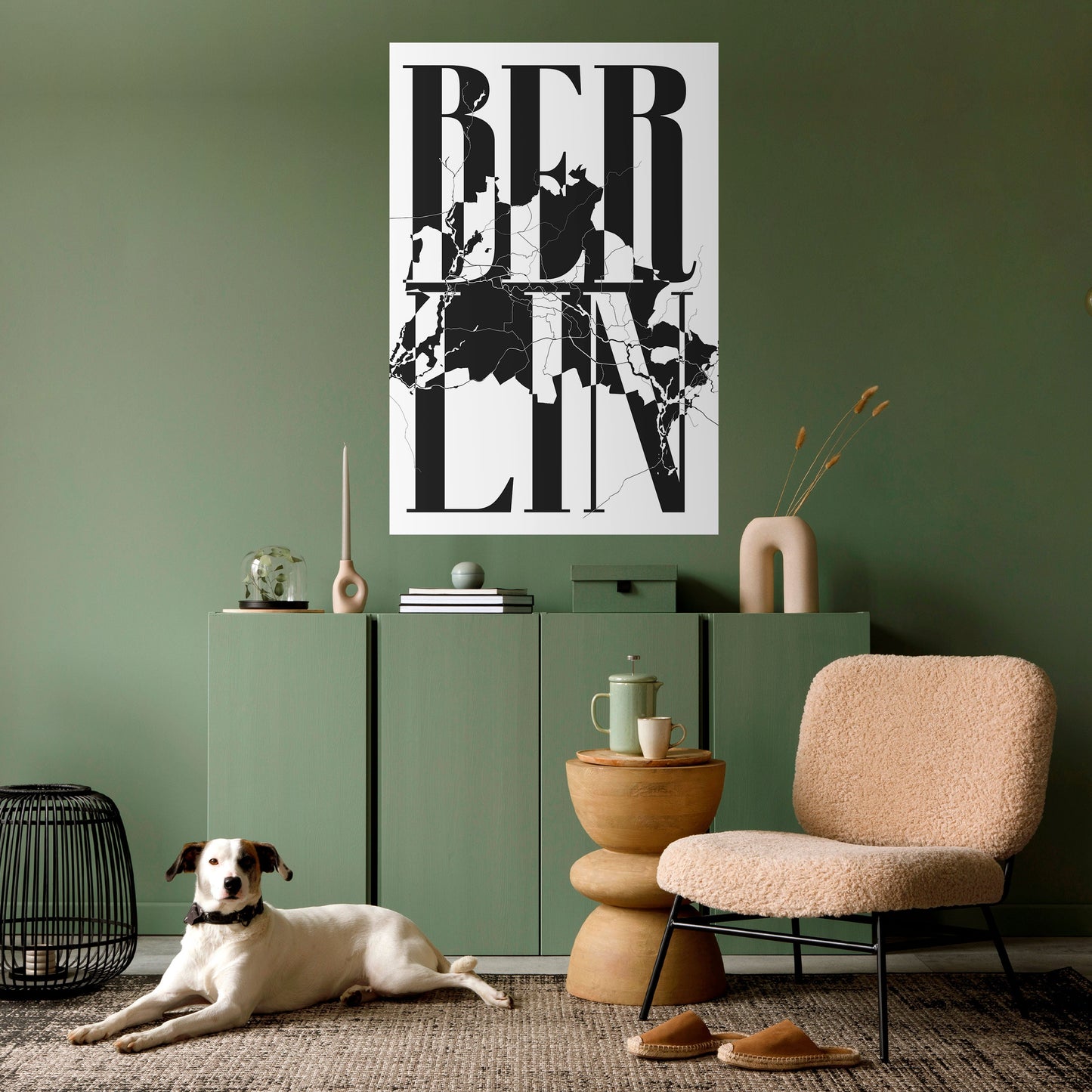
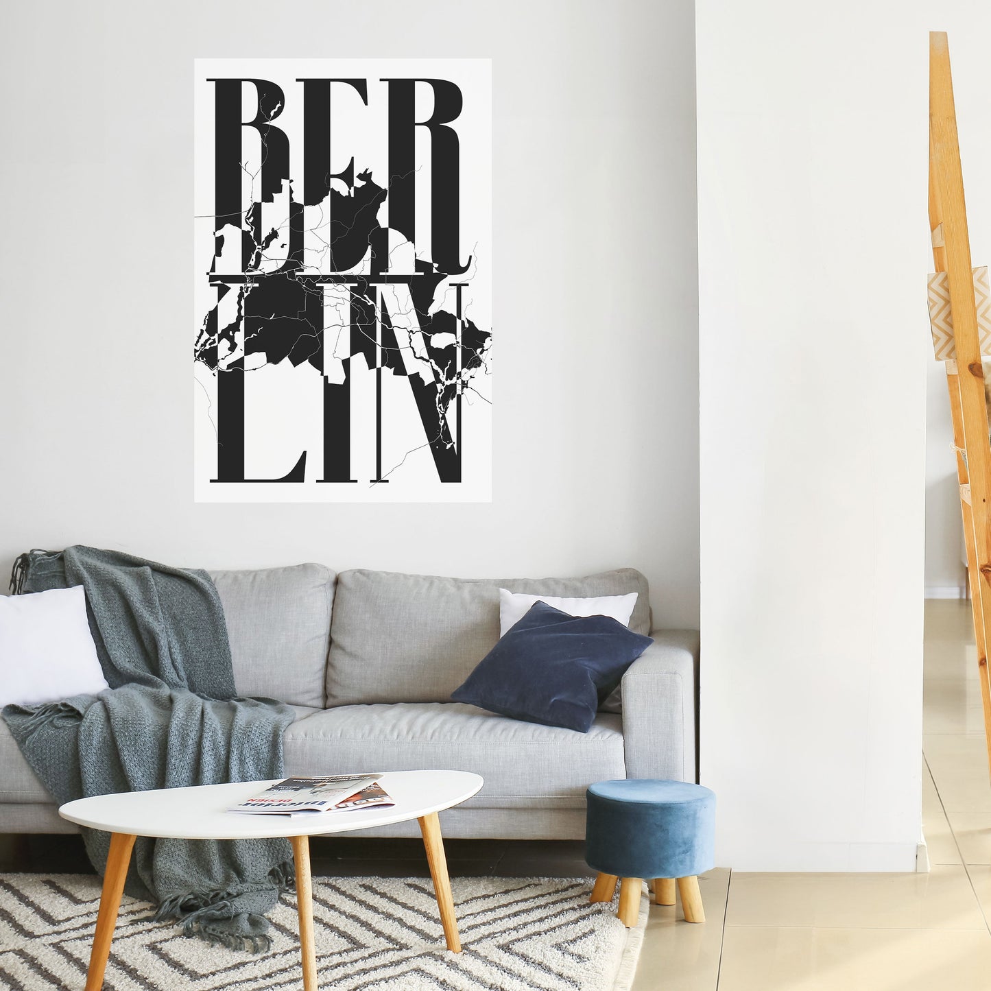
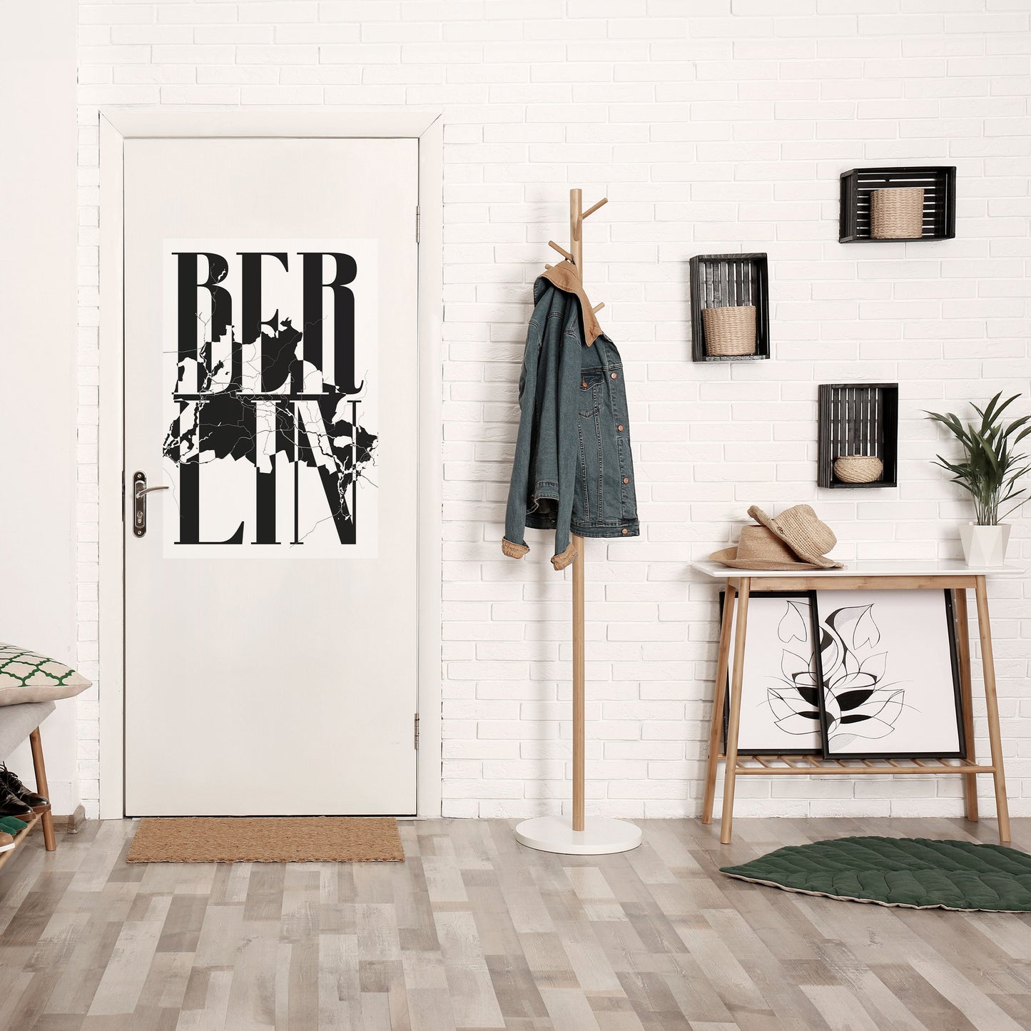
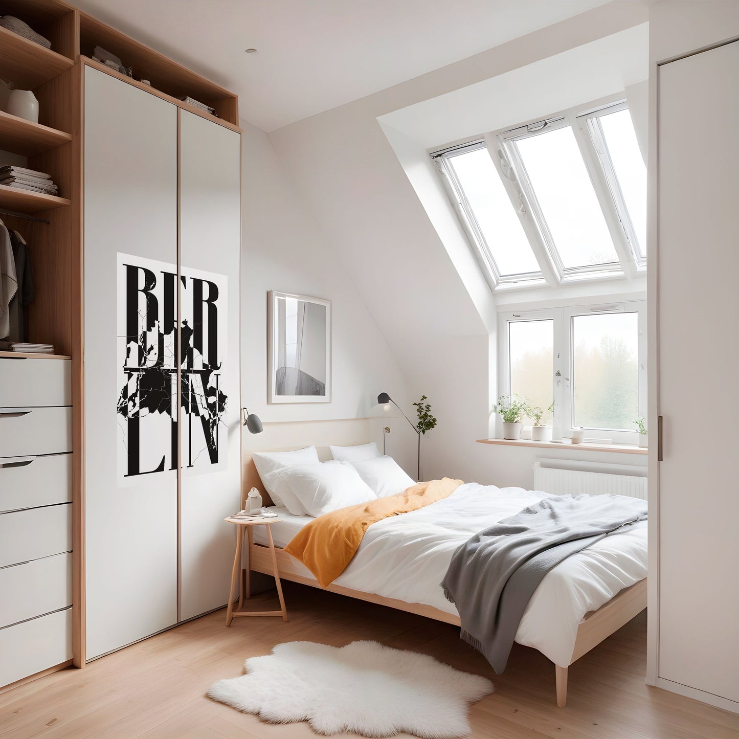
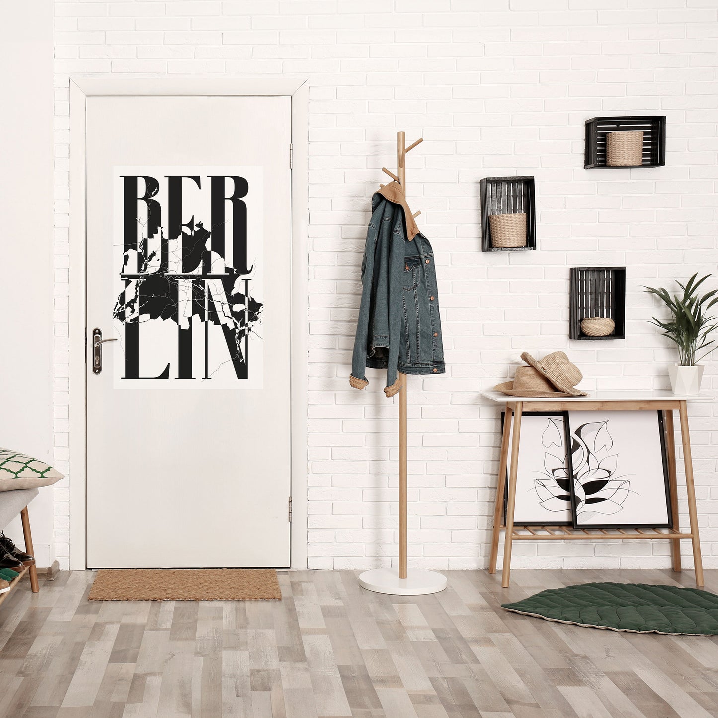
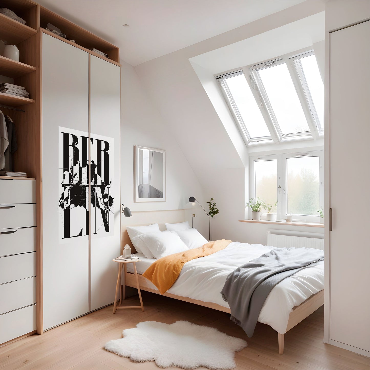
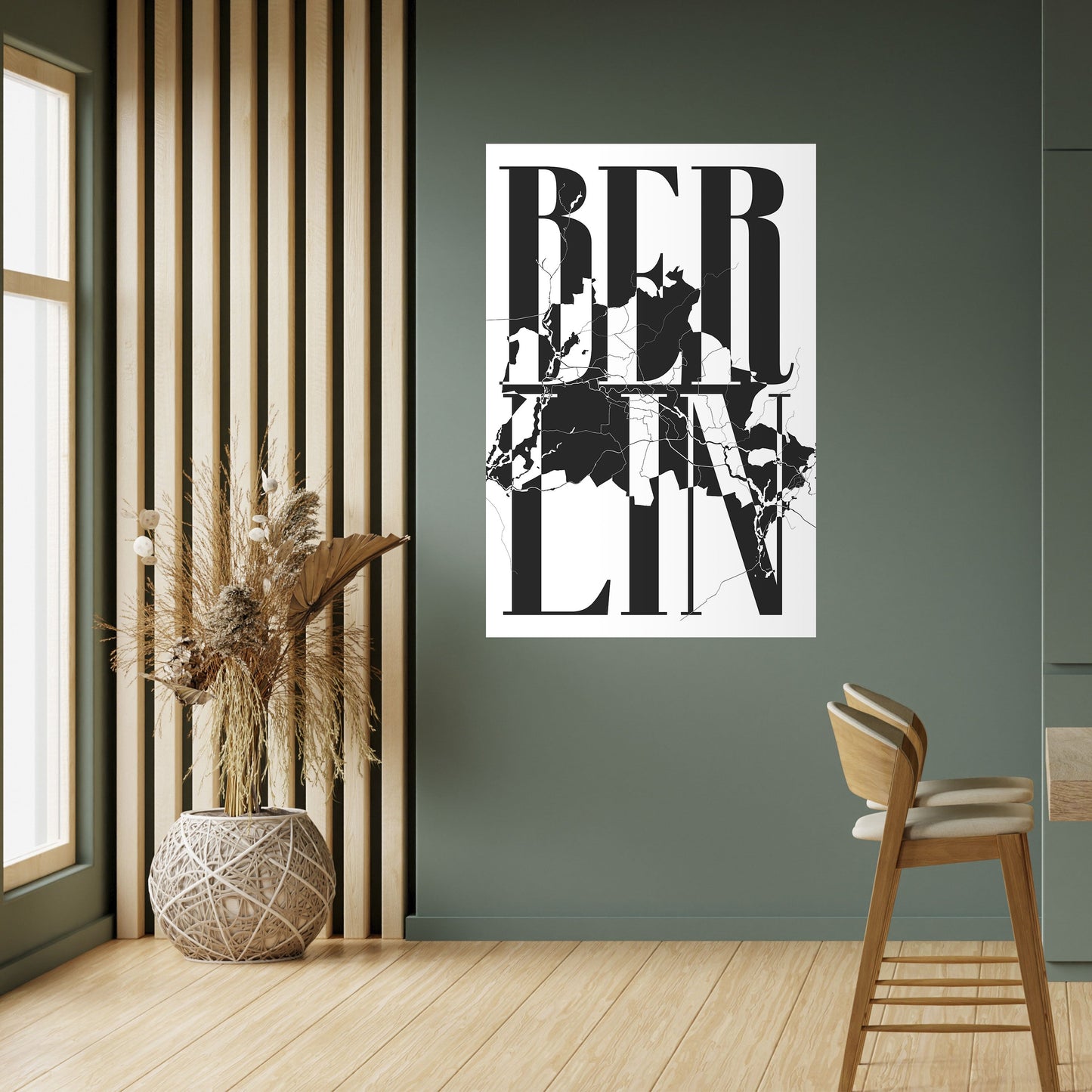
BOLD HORIZONS OF BERLIN
About the motif
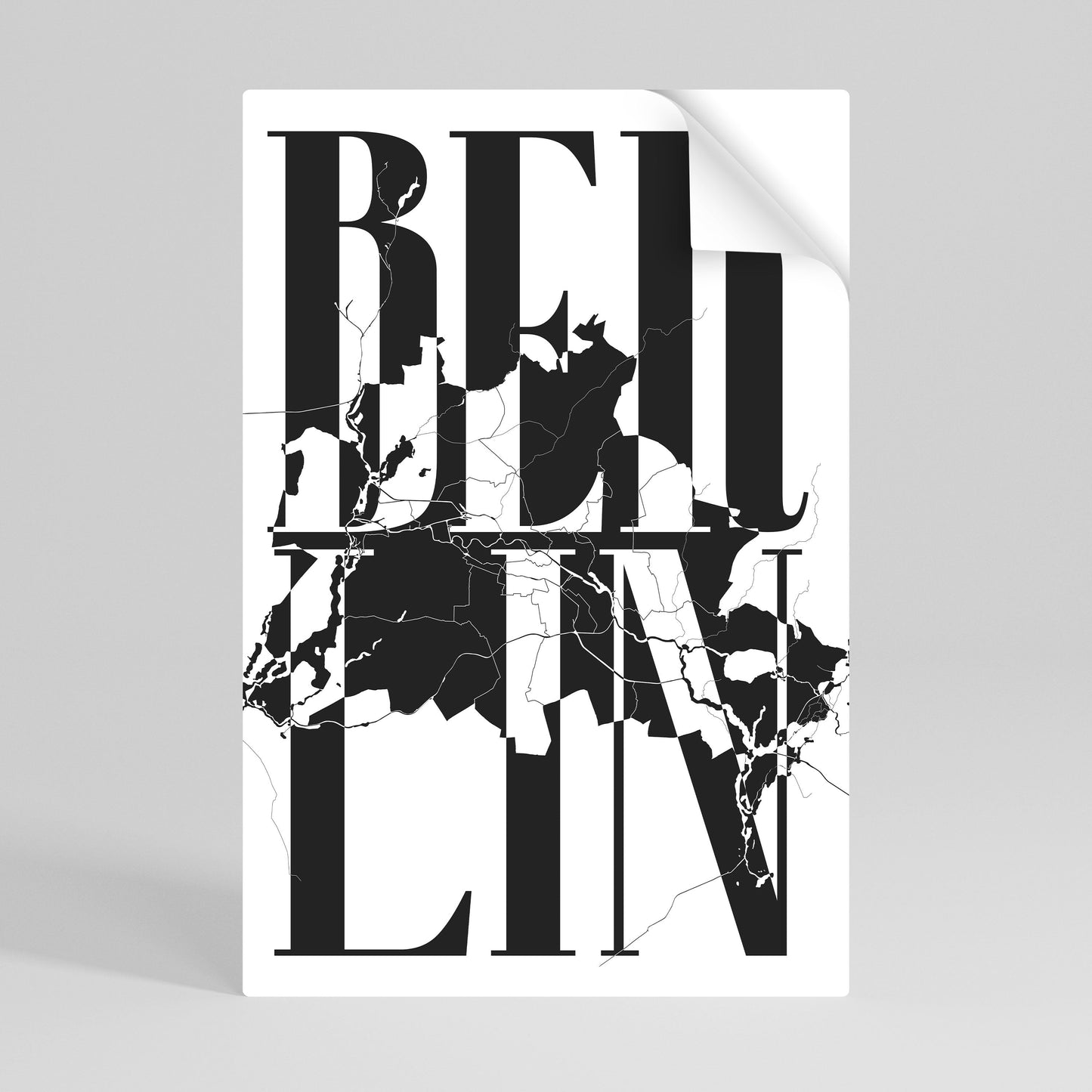
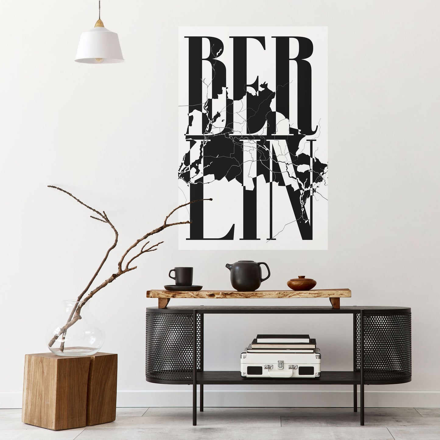
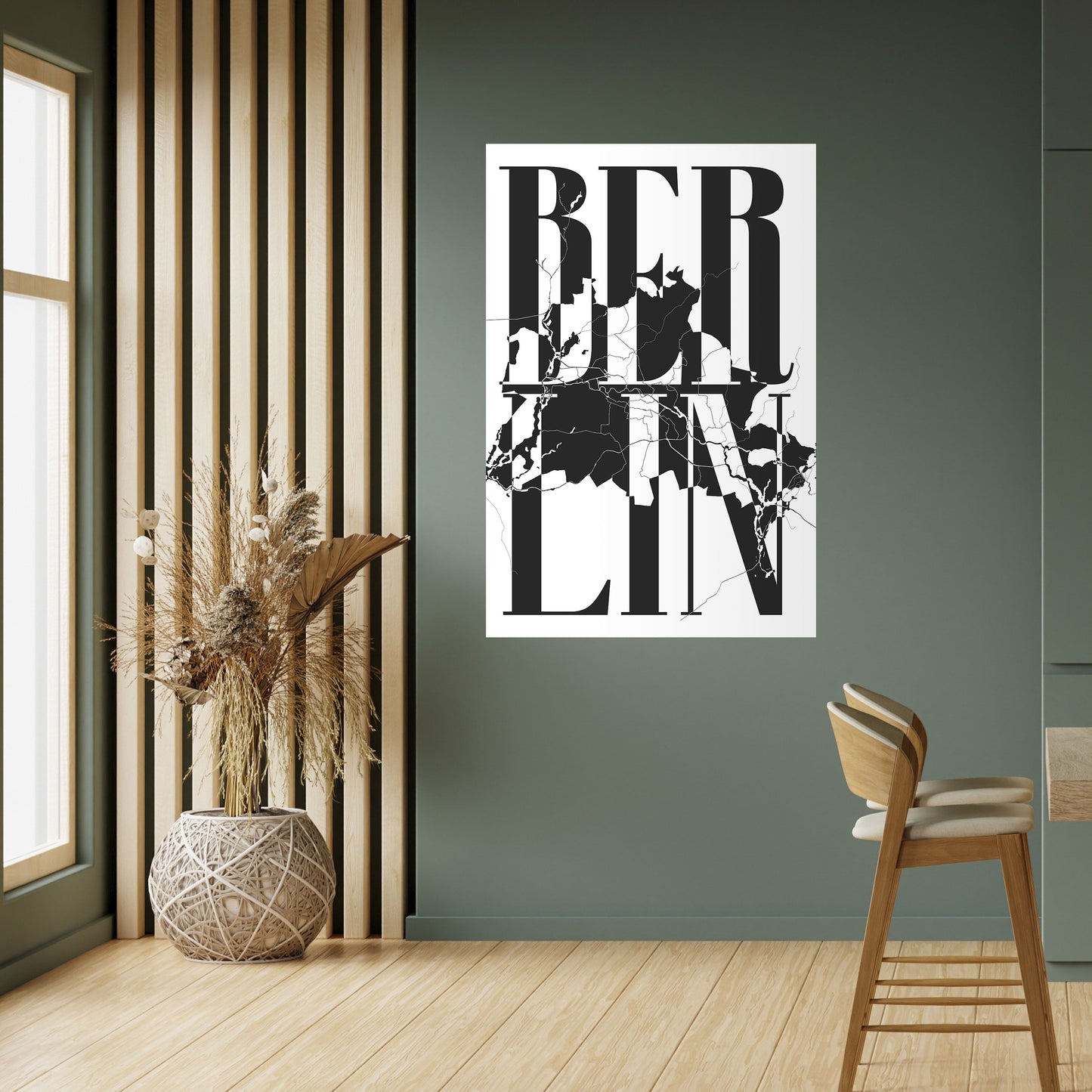
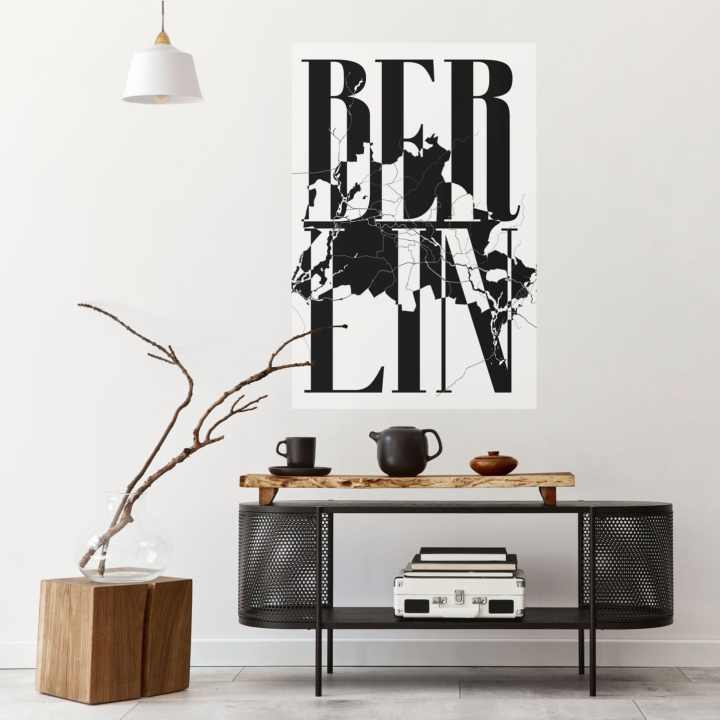
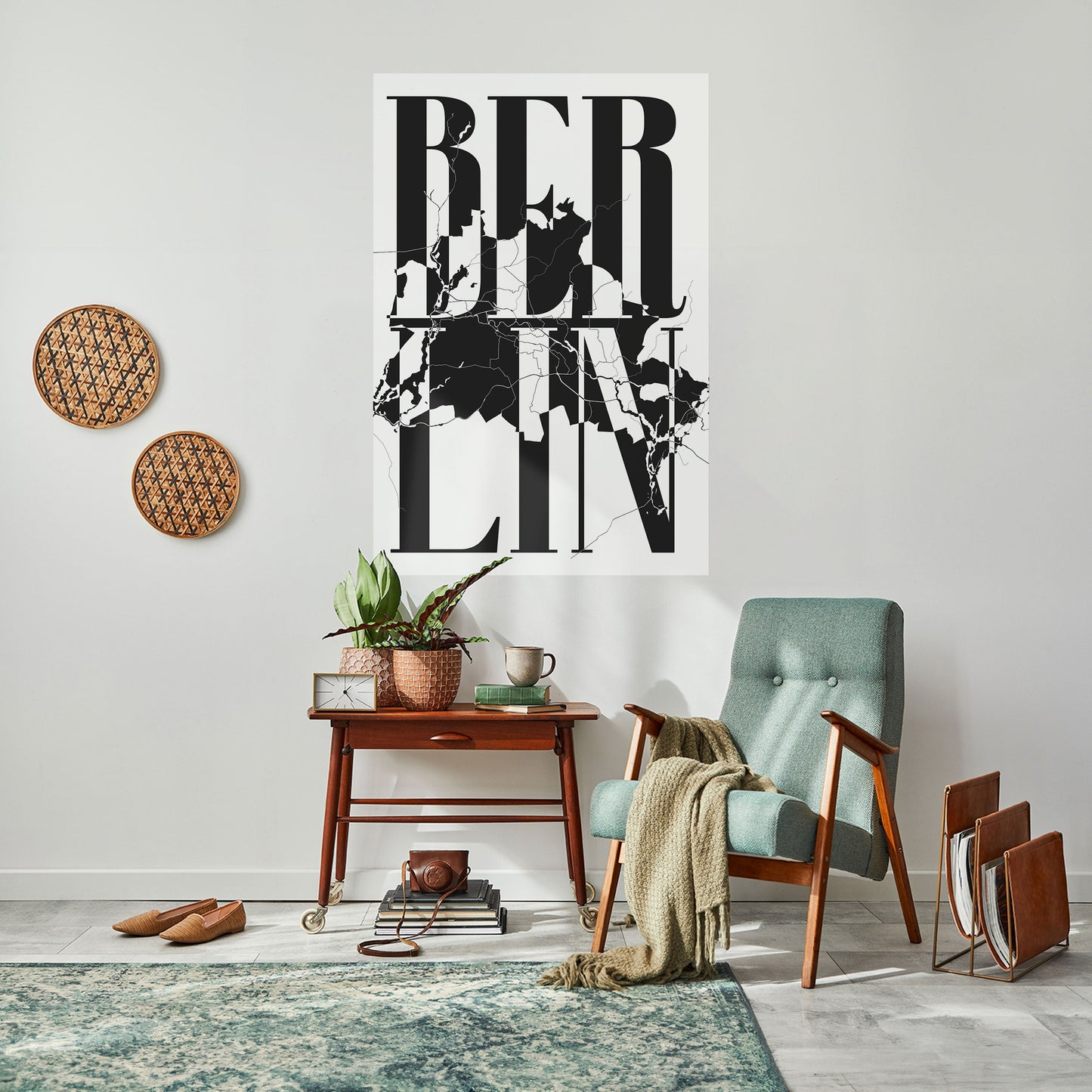
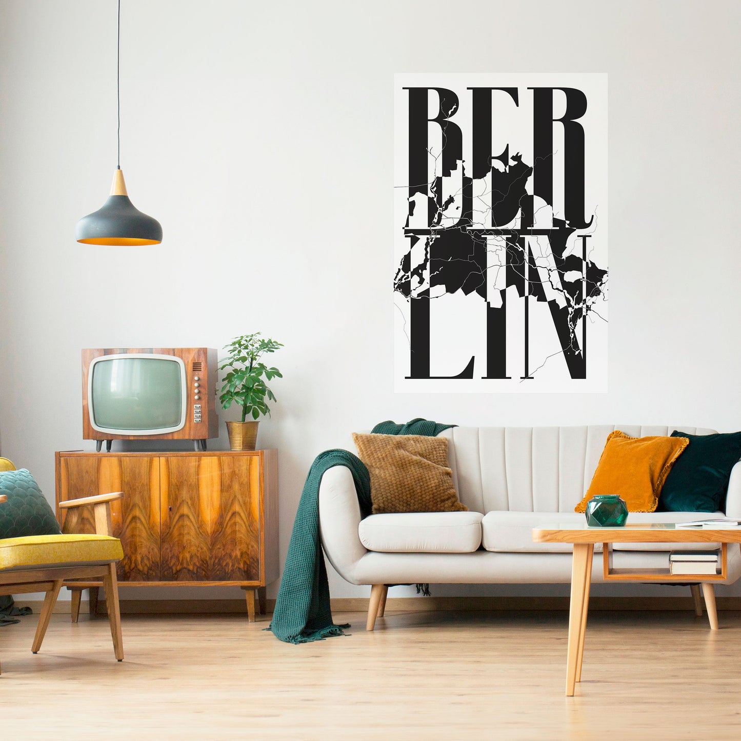
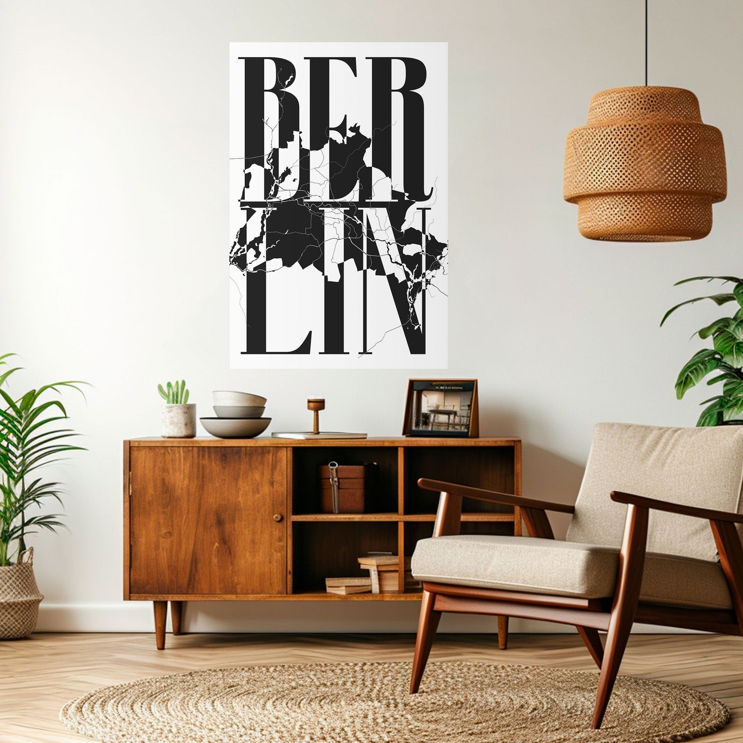
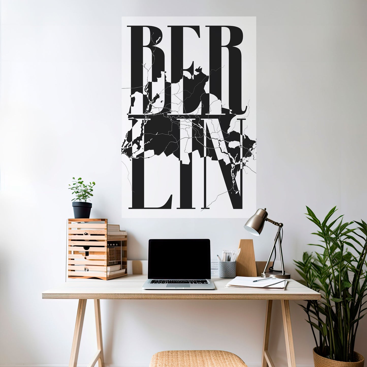
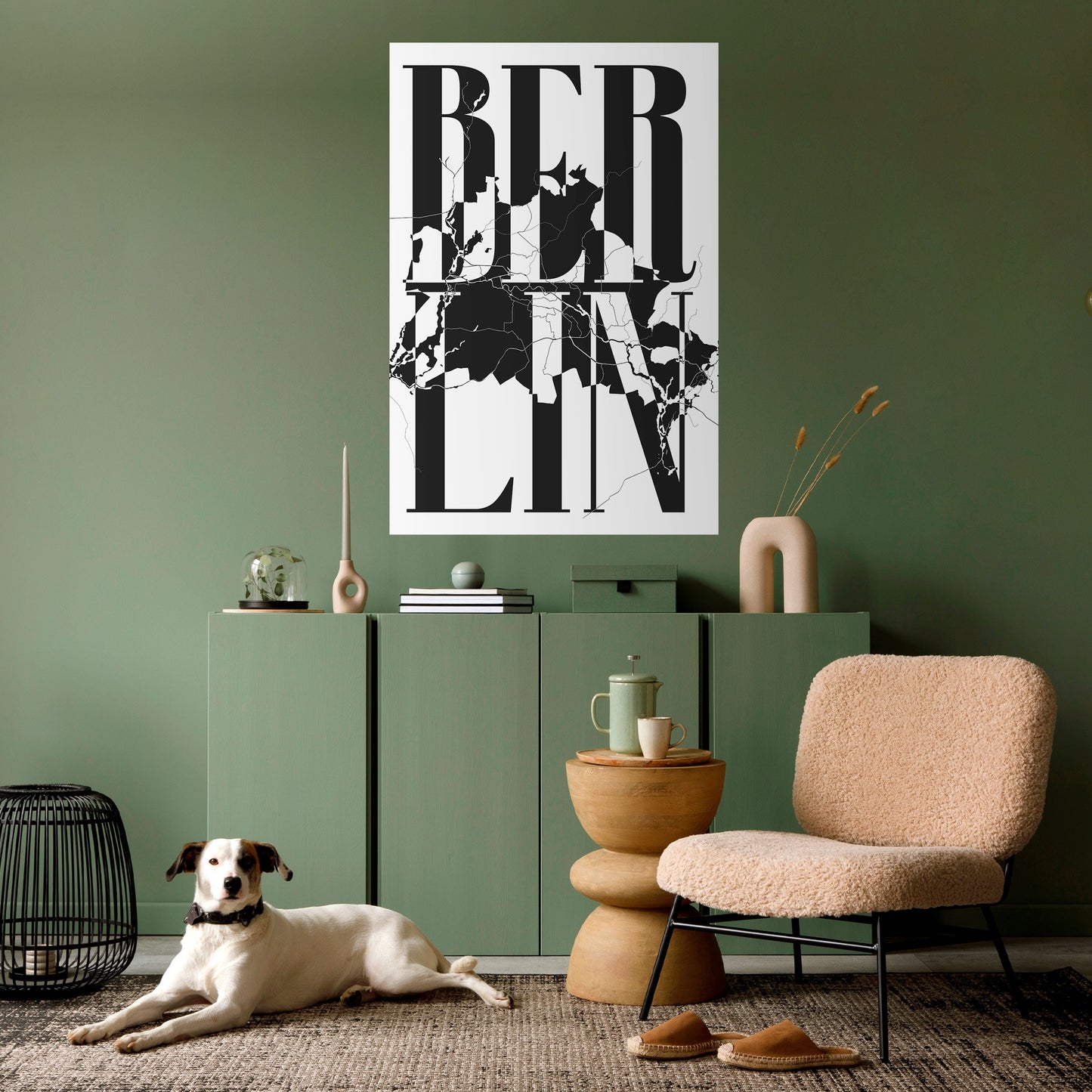
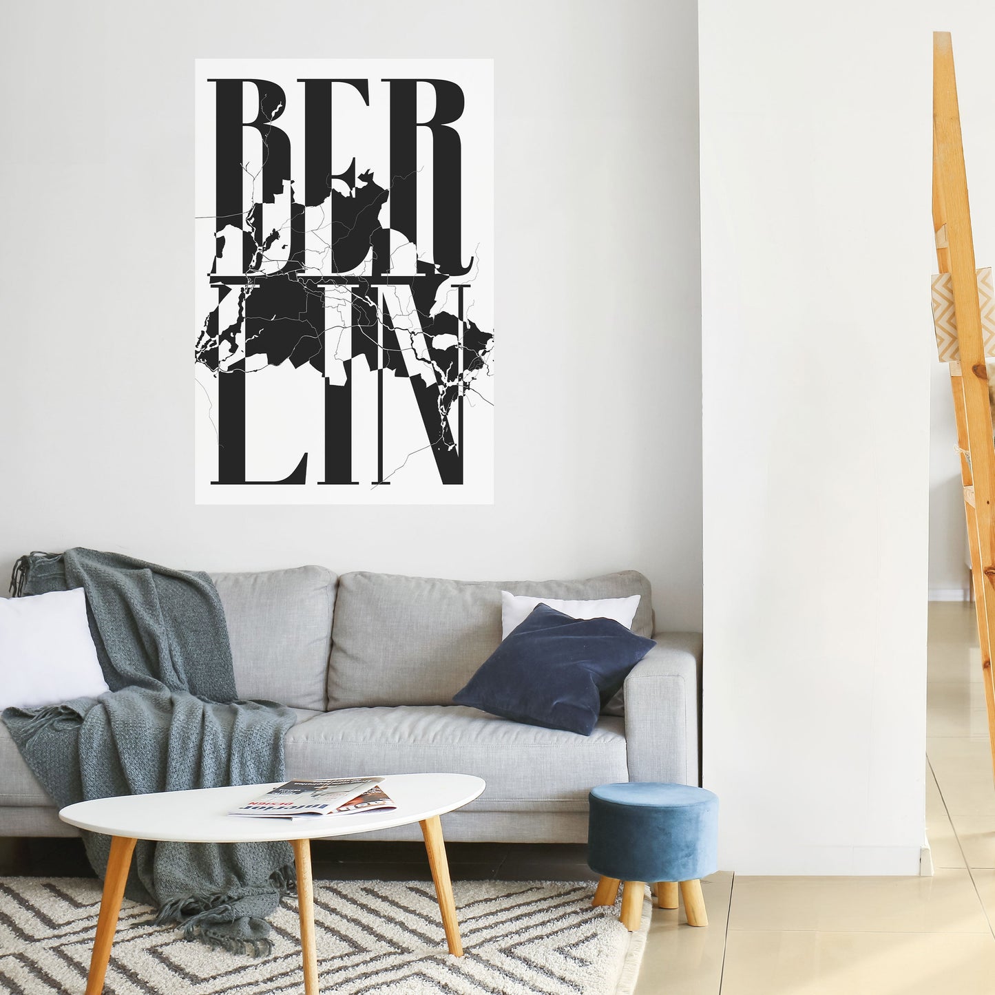
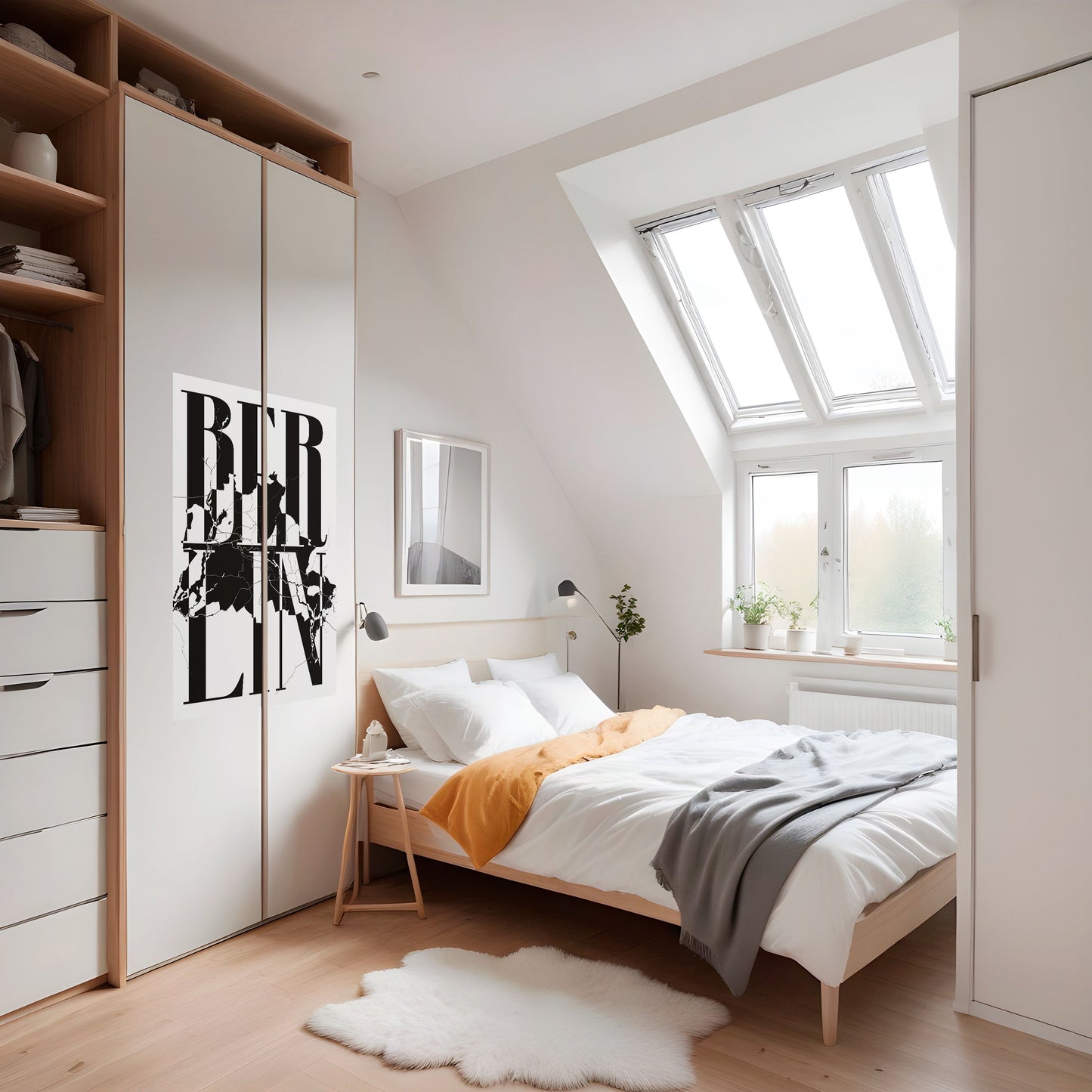
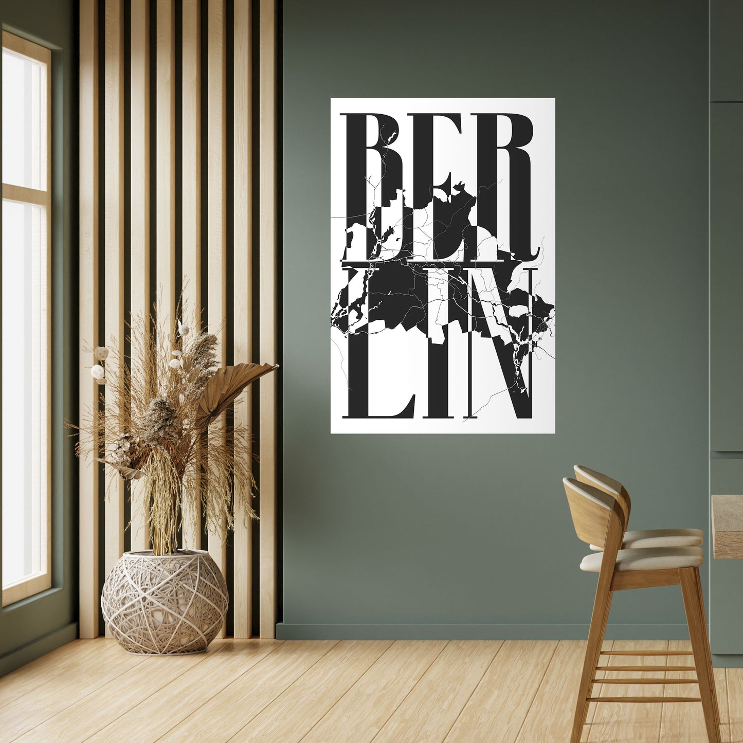
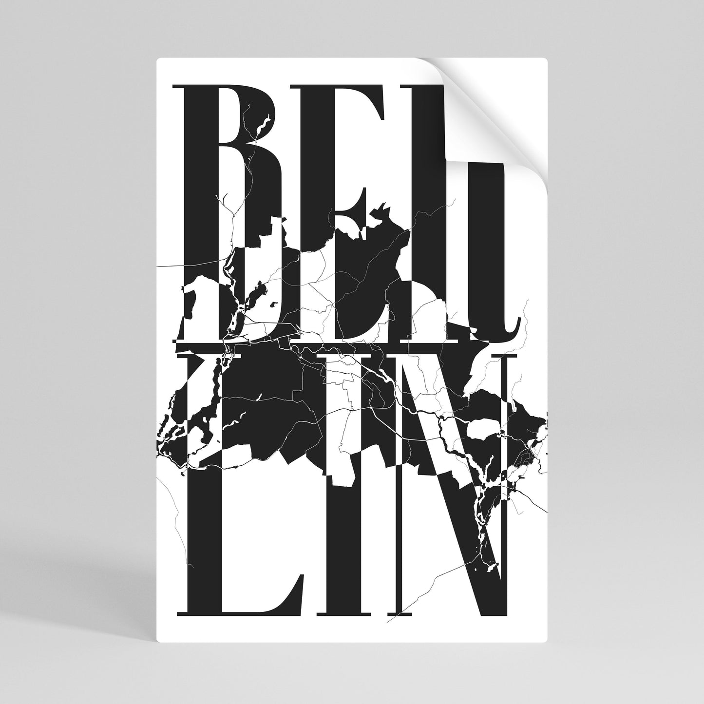
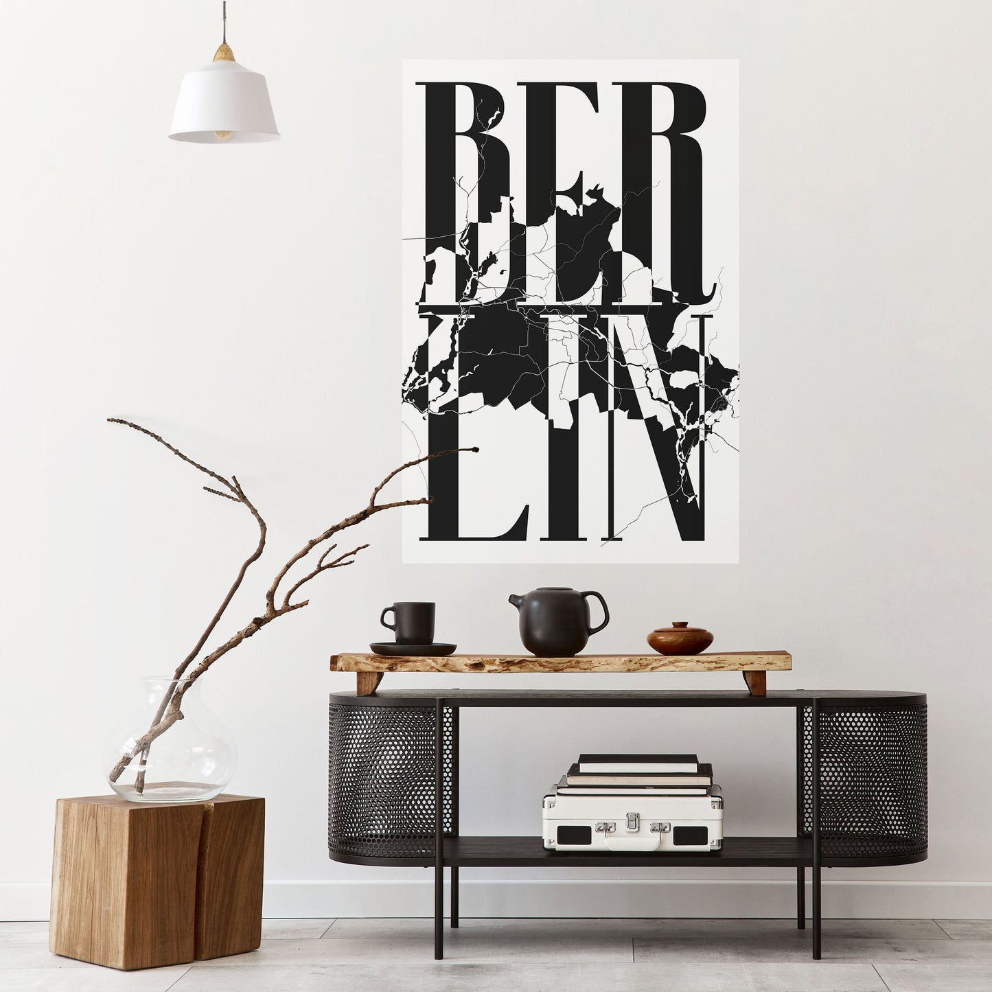
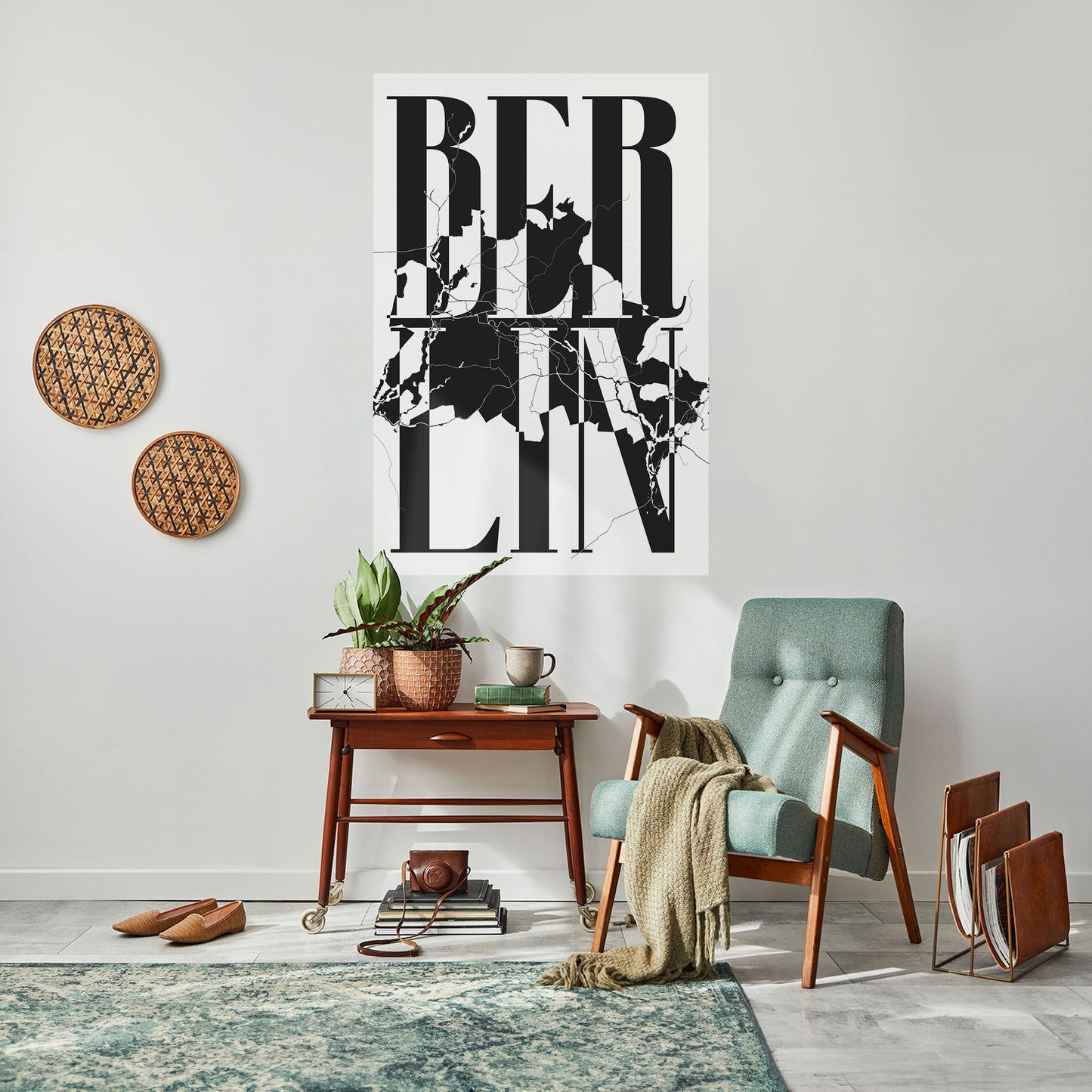
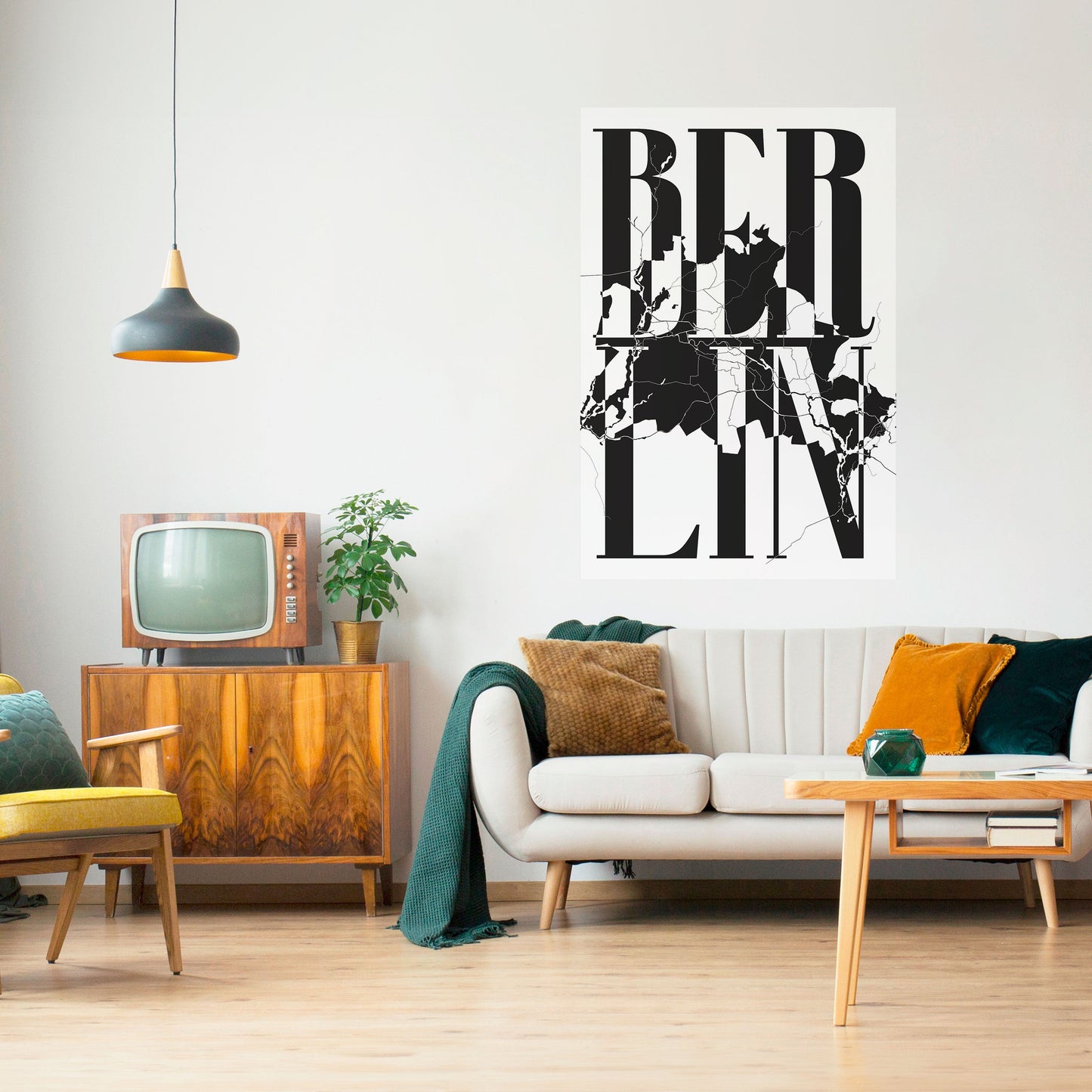
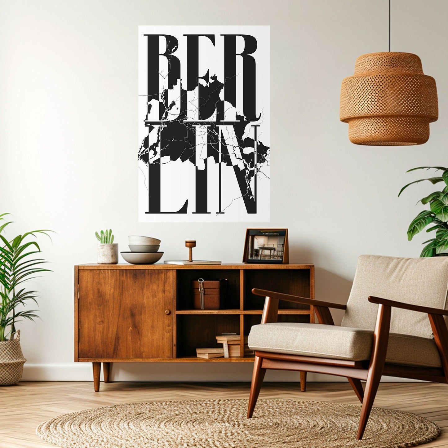
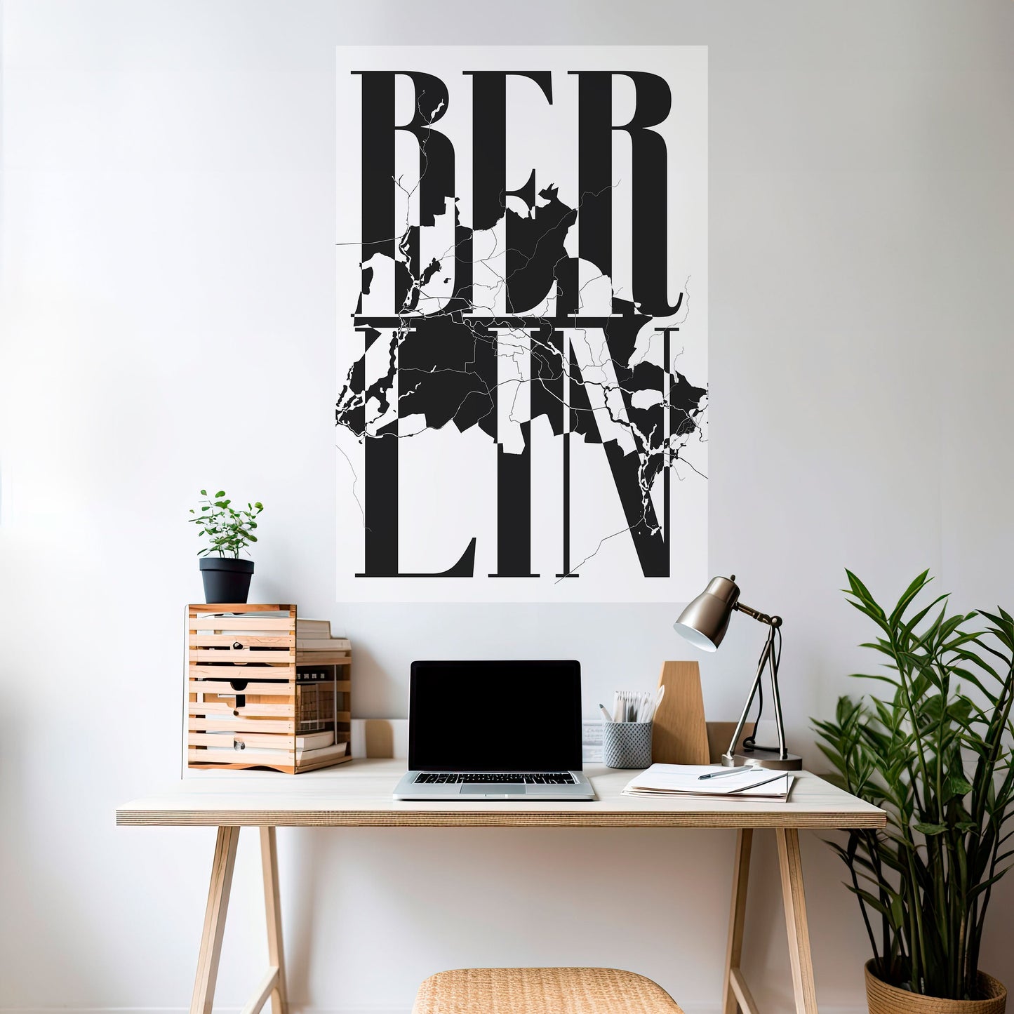
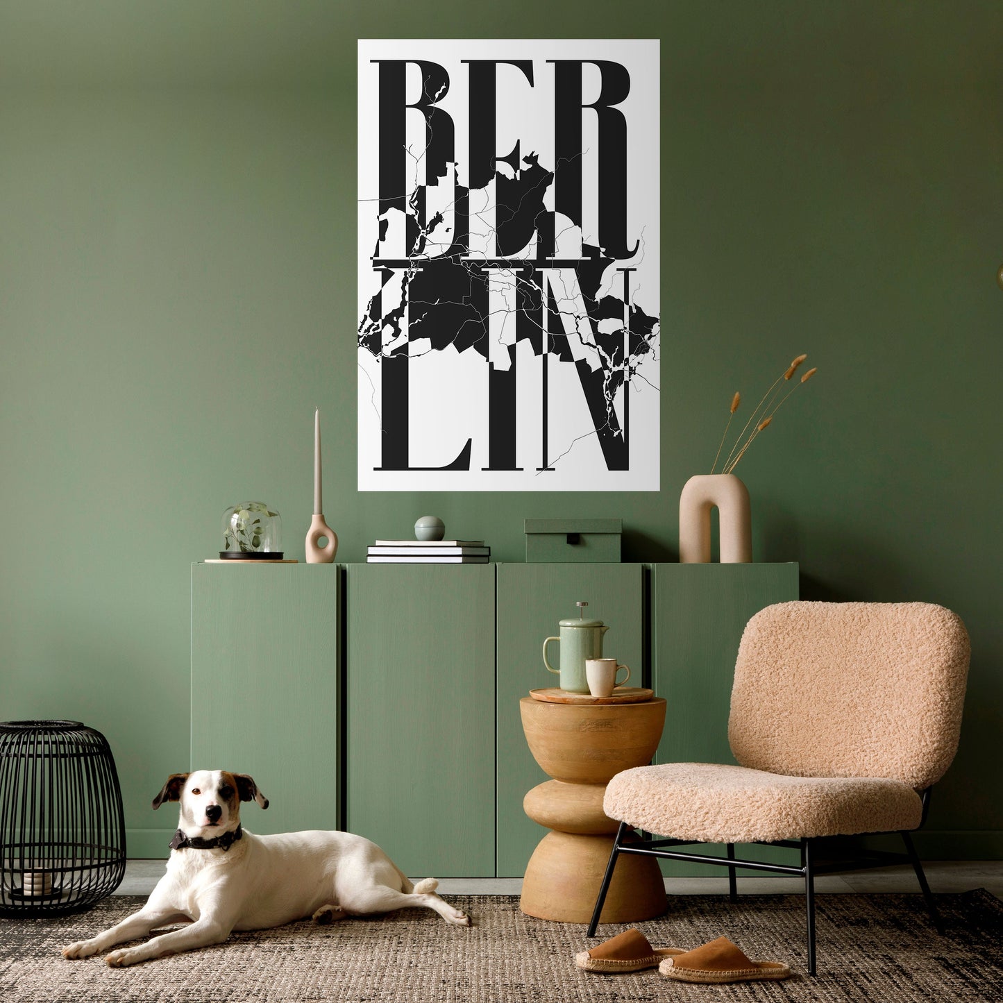
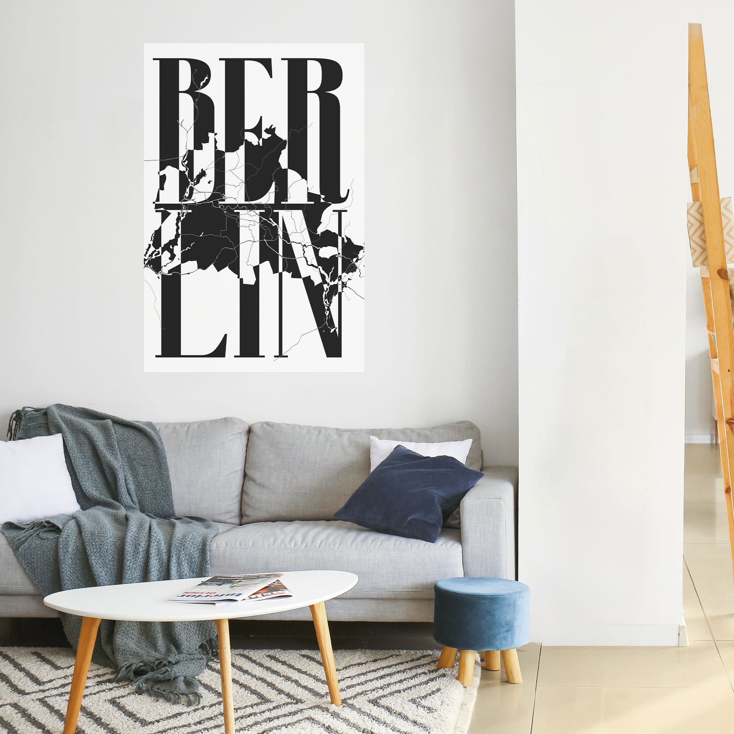
The pattern combines monumental typography with cartographic precision — the name of the city BERLIN, spread across three lines in a serif typeface with striking stroke-weight contrast, intermingles with a fragment of a city map. A network of streets and district boundaries shows through the letters, creating tension between the order of the word and the organic chaos of urban fabric. The raw black-and-white palette underscores the graphic power of the composition, giving it the character of a poster from the Berlin avant-garde.
Interior use
This pattern fits perfectly into your industrial loft or minimalist study, where graphic boldness meets an urban spirit. It also works well in your living room styled as modern or scandi — as a striking reference point for the whole arrangement.